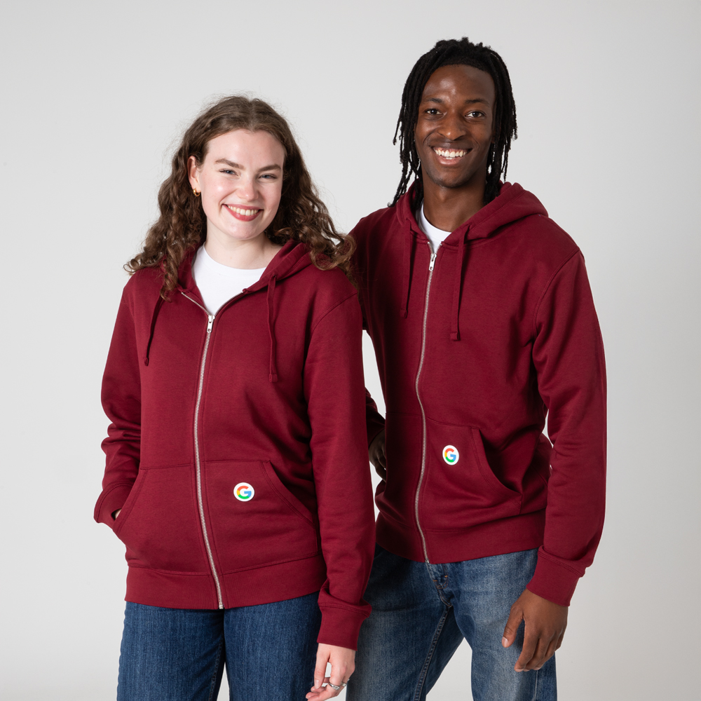
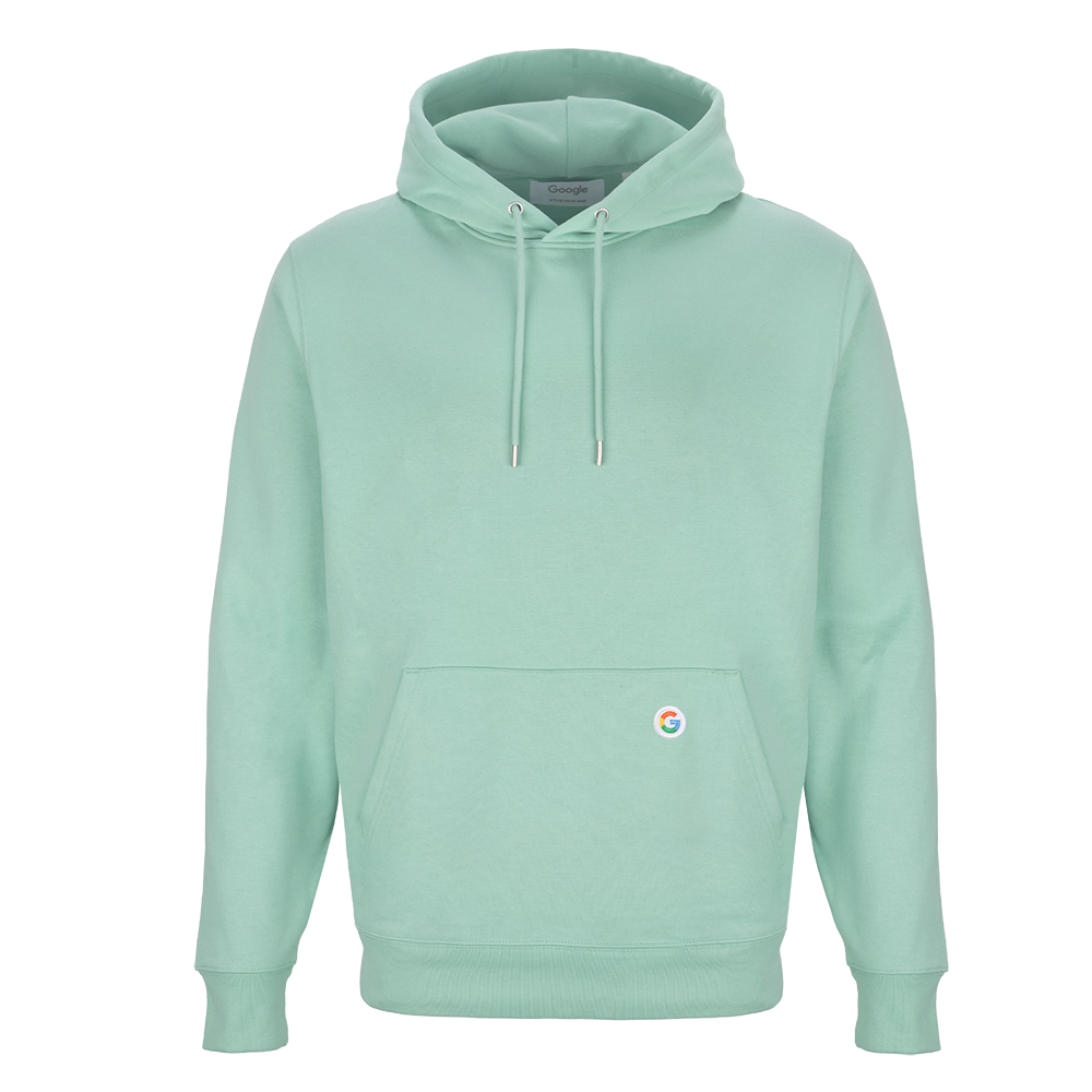
<style> .ba-banner-row { border-radius: 20px; } .ss-26 img { border-radius: 20px; } .more-button { color: white !important; } .more-button:hover { color: white; text-decoration: none; } /* BANNER */ .ba-banner-row { position: relative; } .ba-banner-row figure { display: flex; line-height: 0; } .scoops-text-container { position: absolute; top: 0; width: 100%; height: 100%; display: flex; margin: 0 auto; align-items: center; justify-content: center; text-align: center; } .scoops-text-inner { max-width: 50%; padding: 0 0 0 60px; } .scoops-heading-large { color: #223157; font-size: 48px; } .scoops-p { color: #223157; font-size: 18px; } button { background: #3b5cab; border: 1px solid #3b5cab; border-radius: 20px; } button:hover { background: #3b5cab; border: 1px solid #3b5cab; border-radius: 20px; color: white; } @media screen and (max-width: 767px) { .scoops-text-container { position: static; text-align: center; } .scoops-text-inner { padding: 20px; width: 100%; max-width: unset; } .ba-banner-row .pagebuilder-column-line .pagebuilder-column { flex-direction: column-reverse !important; } } @media screen and (max-width: 1024px) { .scoops-heading-large { font-size: 40px; line-height: 40px } } </style>
Spring Summer Collections 2026Spring Summer Collections 2026
<div class="scoops-text-container"> <div class="scoops-text-inner"> <h1 class="scoops-heading-large">Scoops of Summer</h1> <button> <a href="/spring-summer-2026" class="more-button">Discover SS26</a> </button> </div> </div>

Hoodies & Sweats

3 Items

Set Descending Direction
  1. Sale
  2. Sale
  3. Sale
per page
" "